
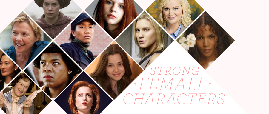
A couple weeks ago, I complained about the Dove campaign and its pseudo-inspiring message of “You are more beautiful than you think.” While there are definitely merits in this message, and there are definitely some refreshing strategies that Dove employs—showcasing women of different shapes and sizes, for example; focusing on empowerment rather than sexualization—it continues to prioritize women’s looks, and their relationships with their looks, which subtly bolsters their own goal of selling beauty products. Not to mention the corporation that owns Dove also owns Axe, which has plenty of problems in its sexualized representations of women. Now I want to go to another extreme of problematic advertising. I call it: Is there anything creepier than American Apparel ads?
Gah. American Apparel ads. They make my skin crawl every time they pop up in the upper right hand corner of a Gothamist website or on the inside partition of a downtown bus stop. All of the photos of the female models look like they were taken by a ‘stached man who picked up underage girls in a windowless van and then used a low-fi camera as he posed them across a bedbug infested mattress in his roachy partly-furnished apartment, giving them the creepiest stage directions possible. (Have your mouth hang open. Spread your legs really awkwardly. Give us some armpit.) The models aren’t actually underage, of course, but they tend to be non-professionals and styled in a way that makes them look adolescent. Their hair is bedheaded, they wear no makeup, and they style the mostly innocuous American Apparel catalog (though they do tend towards the super short, and I still don’t get what a “bodysuit” is for) in the most sexed up way possible.
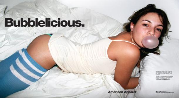
So the plus side of this creeptasmagoria is, I guess, the realism. In the age of Photoshop and flawless, fat-repellent models that were born without hair everywhere except the tops of their heads, it’s mildly refreshing to see the super-unretouched photos of women with a bit of back flab, child-bearing hips, the occasional unsightly mole. It really is. To the extent that it’s presenting women as they really look, it’s a good thing.
But whoa. That’s the only “good” I can come up with here. Because everything else about it is so wrong. The realism in question is ultimately employed to give the viewer the impression that there’s a semi-conscious high school teenager in their bedroom waiting to be seduced. It’s hypersexual and extraordinarily male gaze-y, and it’s a major contribution to the objectification-of-women canon that American advertising seems intent on compiling an epic volume of. Not to mention, it feels like we are seeing way more of American Apparel CEO Dov Charney’s deepest fantasies than we ever wanted to, way more than should ever be made manifest.
Which begs the question: if Dove overemphasizes a normative “beauty,” and American Apparel oversexualizes a physical “realism”—if Dove plays into the insecurities of the female gaze, while American Apparel plays into the objectification of the male gaze---where is the happy medium? What kind of advertising could possibly get it right? It’s hard to say. As it is, advertising is so much an extension of our culture’s already existing ideas about beauty, sex, and women that it’s hard to know where problems begin and end.
It's also quite the sad state of affairs when one has to go to an American Apparel ad to find "realism" in women's advertising. My ending request, the potential for compromise: could we have some of the unretouched-ness happening in ads other than Dov Charney's artistic vision of barely legal 1970s porn?